Howitt, M. (2002). The Spider and the Fly (1st ed.). Ill. Tony DiTerlizzi. New York: Simon & Schuster Children's Publishing.
This 2003 Caldecott Honor Award winning text of The Spider and the Fly is sophisticated and deeply detailed. Its lyrical format gives this poetic book’s plotline a pleasing and easily read rhythm. The poem upon which this Caldecott Honor Book is built is almost two-hundred years old. Yet this fresh take on a traditional poem is a strong cautionary tale that modern younger readers will recognize: Never Talk to Strangers. At the end of this book, the Spider writes a letter to his readers, further explaining his motivations. This is a unique addition that adds an interesting perspective to the original poem and adds to its contemporary feel. The language in this picture book is of a more complicated nature and is obviously designed for a higher level reader but adults could easily read this book to younger children who would benefit and enjoy its message.
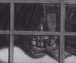
The Spider and the Fly is obviously intended for older children. The plot is more complicated, the inferences are more subtle, but it is the illustrations which set this text apart from books for little children. The details found woven throughout the illustrations and borders support the macabre feeling of the poem but also show a drier wit than the more obvious humor found in My Friend Rabbit. The borders, the small details in each picture, even the addition of web strands to panels in which the spider continues to guide the lady-bug to her doom show a sophisticated nature to DiTerlizzi’s illustrations. The colors of the pictures follow the theme of an old movie with the shadows and highlights that remind older readers (adults even?) of Film Noir, dime-store detective stories, Humphrey Bogart and Lauren Bacall. It seems odd to find these themes echoed in a children’s picture book, but the themes that scared audiences in the 1950s are still effective today. DiTerlizzi uses simple black and white acrylic gouache and pencil with black and silver duotone paper for the main parts of his illustrations. However an added detail was the method that he used for the ghost bugs: they were created from graphite and added as a transparent overlay using Photoshop. This technique, including the use of bright white text on the dark pages, helped to lend the creepy, otherworldly aura to the illustrations of The Spider and the Fly.
* Be sure to link to a Youtube video of Tony discussing this book from the Illustrator Studies home page!